Android Widgets Worth Using: Less Tapping, More Done
Widgets were Android's party trick in 2010 and its neglected drawer by 2020, but the 2026 generation deserves another look. Material You restyled them, stacks and smart rotation made them compact, and the good ones now show exactly what you need without opening anything. The catch is the same as ever: nine out of ten widgets are space-wasters, and the tenth replaces fifty daily app opens.
The test for any widget is one question: does it show information you act on, or controls you actually press? If the answer is neither, it is decoration, and decoration belongs in the wallpaper.
Calendar and Agenda: The Undisputed First
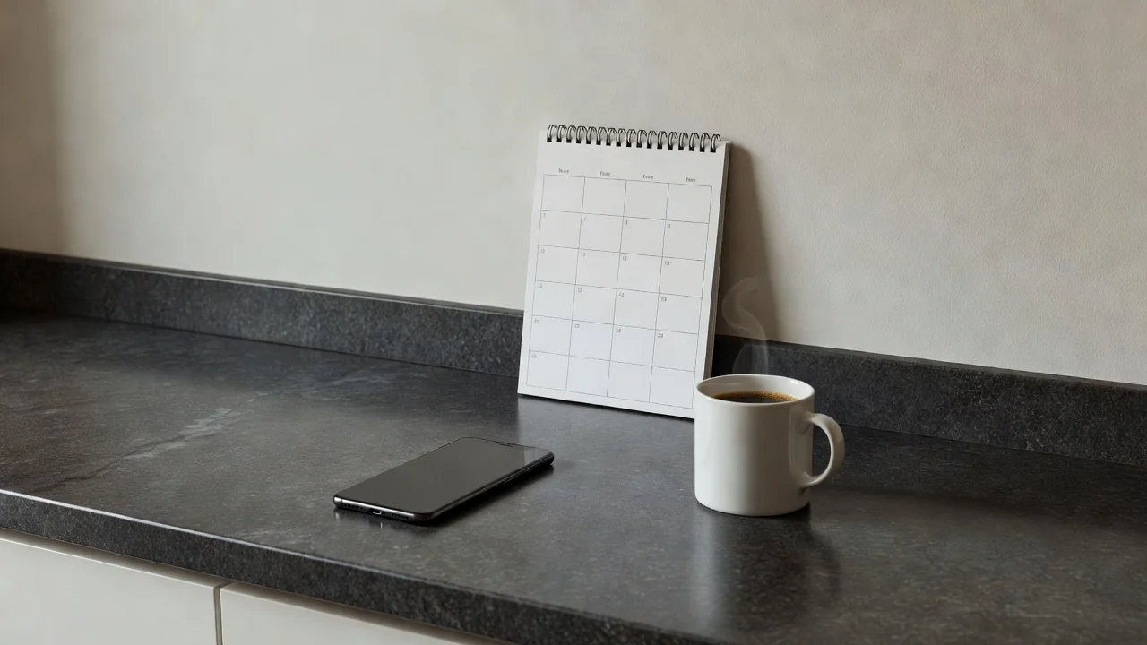
An agenda widget answering what is next is the highest-value rectangle on any home screen. Google Calendar's schedule view shows the next few events with times and locations, and a glance replaces the open-app-scroll-close ritual that happens a dozen times a day. Size it to show three events; one event hides too much, six events becomes a wall of text you stop reading.
Weather, Battery and the Glanceable Trio
A compact weather widget earns its place if it shows the next hours, not just the current number you can feel through the window. Battery widgets that report the phone and connected earbuds or watch in one row save a daily dive into settings. Together with the agenda, these three cover most glances, which is the entire point of a home screen.
The digital wellbeing widget belongs in this tier for a different reason: it shows your screen time where you cannot unsee it, and the number on the home screen changes behavior more reliably than the same number buried in settings.
Notes and Tasks: Capture Without Opening
A notes widget with a tap-to-add field shortens the path between thought and record to one touch. Keep a shopping list or an inbox note pinned; the friction saved is the difference between writing it down and trusting memory. Task apps with checkbox widgets turn the home screen into a working list, which suits some people and clutters others.
The honest filter: if the list has not been checked off in a week, the widget is furniture. Move it to a secondary screen or remove it, and let the home screen keep its one job.
Music, Smart Home and One-Tap Controls
Control widgets justify themselves when the action is frequent and the app is slow to reach. A music widget with play controls saves the unlock-find-app sequence on every commute. Smart home tiles for the two scenes you use daily, lights off and thermostat, beat opening a hub app that loads like a website.
Keep controls to one row. A home screen of buttons is a remote control with extra steps, and every control widget is also a small battery cost for its background updates.
Stacks, Sizes and Battery Sense
Where the launcher supports stacked widgets, one slot can rotate between calendar, weather and notes with a swipe, which triples density without clutter. Whatever the style, two widgets per screen is a sensible ceiling, and each one should refresh politely: hourly weather is fine, per-minute anything is a battery habit you did not choose.
The Widget Shortlist
| Widget | Job | Recommended size | Verdict |
|---|---|---|---|
| Calendar agenda | Next events at a glance | 4x2 | Essential |
| Weather hourly | Next hours, not current | 4x1 | Strong |
| Battery row | Phone plus earbuds | 4x1 | Useful |
| Notes quick-add | One-tap capture | 4x2 | Strong |
| Music controls | Commute playback | 4x1 | Situational |
Rules that keep widgets working for you:
- Add one widget at a time and give it a week of honest use.
- Size for content: three events, four hours, two controls.
- Stack where the launcher allows it instead of adding screens.
- Remove any widget untouched for two weeks without ceremony.
- Prefer widgets with sensible refresh intervals for battery.
The right two widgets turn the home screen into a dashboard you actually read. The wrong ten turn it into a shop window; choose like a minimalist and keep like a pragmatist.